 Sam Tuke
For over a month we’ve been interviewing Lightmeter users each week to understand their needs, and best prioritise features. Rudolf has produced dozens of wireframes and click prototype iterations exploring and refining UI concepts.

Guiding principles
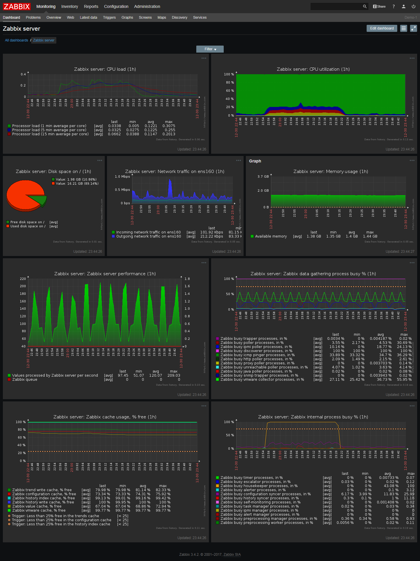
Most existing infrastructure monitoring interfaces, including the original Lightmeter prototype, take an information dashboard approach to communicate systems’ status. While dashboards are traditional and familiar, we’re working to avoid them. Here’s why.
Dashboards:
- Pack a lot of different types and sources of information into a small space
- Typically rely on charts, which by their nature are hard to interpret
- Typically lack context. The relationship to norms and expectations is obscure.
- Frequently lack analysis and conclusions. Required action is unclear.
These factors make dashboards hard work to use and benefit from. Most of the work must be done by the viewer: to pick out what’s relevant, recognise deviation form good operation, and decide how to act in response.
Extensive experience with both the underlying systems, and the metrics and dashboard themselves, are required in order to do these things effectively. Dashboard which are highly configurable, for example with drag-and-drop placement, in most cases only add to the complexity and inconsistency between users and views.


Lightmeter’s goal is to make mail servers accessible and easy to operate. This requires more than merely in collecting data into a single location. We need to make derive meaning from the data, and provide effective recommended actions.
To this end, graphs and must serve the higher goal of communicating the meaning of the server’s behaviour. What you must to do to get mail delivered is more important than knowing what has happened — both these views of events should be accessible, but the former should be prioritised.
Guiding rules
To resist the temptation of regressing back towards a traditional dashboard interface, we established some simple UI rules derived from the above principles:
- Refer to interfaces not dashboards (“If thought corrupts language, language can also corrupt thought” — Orwell)
- Graphs must follow interpretation and context (never draw the eye to a graph before its meaning has been stated)
- Prioritise insights over data (data is a means to an end; provide the value of the endpoint directly)
Current status
Our weekly interviews with early adopters is helping to develop an understanding of their needs and how they map with use-cases and profiles. This includes guiding questions around granularity and frequency of updates and notifications, and what size network Lightmeter should be able to monitor.
As reported in the last development update, work on the backend is going well and soon front-end work will start bringing the prototypes to life, depending on project resources and Open Source contributors.
Get involved
- Vue.js developer? We need you! New front-end architecture is underway. Join us on Gitlab, Telegram, or Discourse
- Try out the latest click prototype in a 30 minute web chat and share your views – we need them!
- Check out the Lightmeter repositories on GitLab and get hacking on the existing Go codebase
Related Posts
Development update: Go portable
Lightmeter Control Center is being rewritten in Go, with a new scalable architecture, Unix and Windows support, and in a single tiny downloadable binary
Mar 28 2020

Rebuilt Web Interface in Lightmeter 1.1.0: Benefits of adopting Vue.js
Why we adopted Vue.js for the front-end of Lightmeter: immediate and long term benefits for end-users and developer experience
Dec 26 2020